
Fortune Magazine, March 1942. Copyright Time Inc.
Design and drawn by Richard Edes Harrison
Hello everyone,
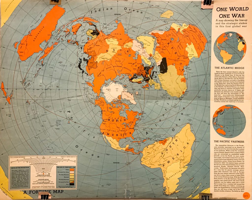
I hope everyone had a restful Thanksgiving and is doing well as the approaching finals and due days are approaching! This week, I would like to feature a World War II map produced by Richard Edes Harrison for Fortune Magazine. Published in 1942, “One World One War” is one of many WW2 news maps that Harrison designed for Fortune from the late 1930s to 1940s. Visualizing the up-to-date global situation of the war with respect to the US, these maps are propagandistic materials that intend to influence the American voting public’s perception of the war.
Richard Edes Harrison is an American cartographer and scientific illustrator. Exploring with the different perspectives and map projections, he has produced maps that were critical in the history of journalistic cartography and the modern conception of space in international politics. His azimuthal projection polar map became the basis for the design of the United Nations logo. During world war II, he worked closely with Fortune as well as the US government. Many of the maps that Harrison made for Fortune, including “One World One War,” were also adopted and used by the US army.
In this map, Harrison displays the world in an azimuthal projection, presenting the latest war situation. The projection and the symbology are explained in the box at the lower left. The nations’ affiliation is shown in different colors with red representing the Allies and black representing the Axis. As a consequence of presenting the globe from the north pole in an azimuthal projection, the southern hemisphere is greatly “shortened” and distorted. The map is in a sense US-centered: North America is placed at the most recognizable center of the map, with the red lines of the allied supply routes connecting the US with the rest of the world. On the right side, two smaller inset maps centered on the Pacific and the Atlantic Oceans show the globe from a perspective that is perhaps more familiar to the viewers, helping them to comprehend the azimuthal map.
Good luck with the finals! 🙂
Yidan Xu ’24